Post
2-Minute Org Charts in Google Sheets
Posted on January 26, 2021 (Last modified on January 16, 2026) • 3 min read • 633 wordsEveryone probably has their go-to application for creating stunning, readable organizational charts — but when you need to whip one up in...

Everyone probably has their go-to application for creating stunning, readable organizational charts — but when you need to whip one up in a hurry it’s not always worth the effort of firing up Illustrator or your design software of choice. When you just need something presentable in a hurry, a placeholder perhaps, or any situation where the information and arrangement is more important than the final presentation, there’s a super speedy way to spin one up in Google Sheets!
Today we’ll walk through the sub-2-minute process and have you back to working on the meat of your presentation or proposal in no time. Let’s get started!
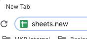
First, enter the URL “sheets.new” to launch a brand new Google Sheet (the Google Workspace equivalent of Excel).
You’ll see a brand new spreadsheet and, while you don’t need to label your columns for this, I have here to make this tutorial a little easier to follow.
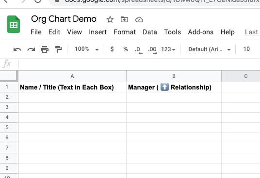
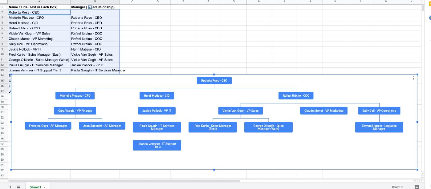
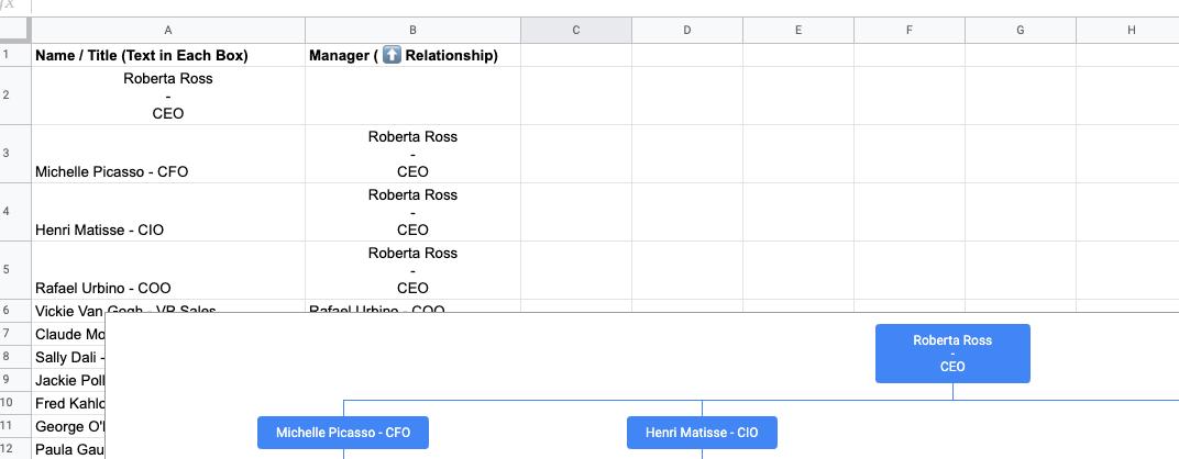
Basically, we’re going to make a two column table with names and titles in the lefthand column, and each title’s respective manager in the righthand column. Begin by entering your names and titles first.
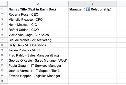
Once those are in, simply copy the relevant “name/title data” and paste it in the righthand column, next to those people/titles that report to them.
And repeat until everyone is labelled appropriately.
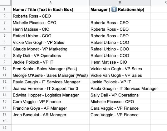
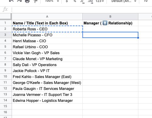
Note: Any name/title cell that has a blank cell next to it will appear at the top of a hierarchy, so here our CEO has a blank cell next to them, meaning they’ll be at the top of the chart. If you were making a joint chart for multiple teams and wanted them to be separate, you’d have two (or more) name/title cells with empty adjacent cells and the results would be two (or more) side by side charts essentially.
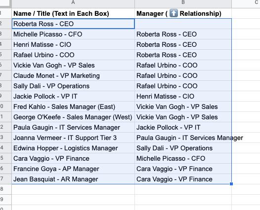
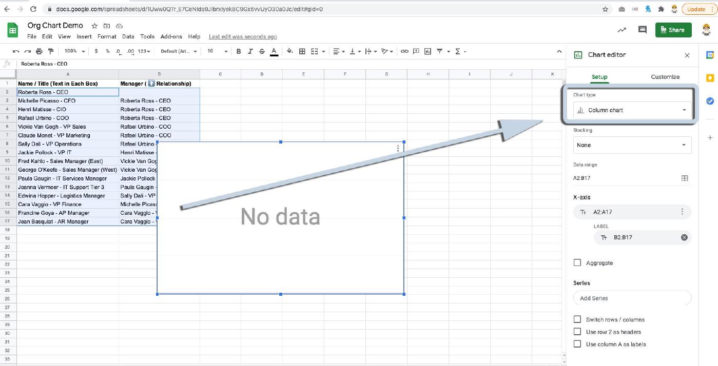
Once all the data is entered, simply select the entire table (and make sure not to select the column labels if you chose to use them).
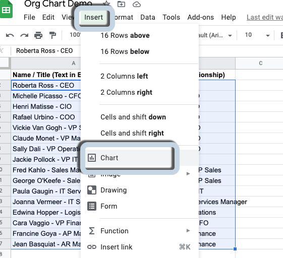
Then select Insert -> Chart from the toolbar.
That will produce a “No Data” chart on your page that can be moved or sized.
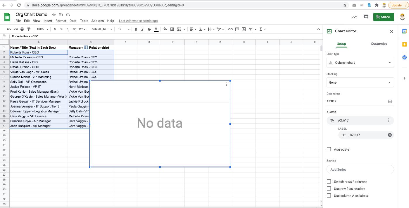
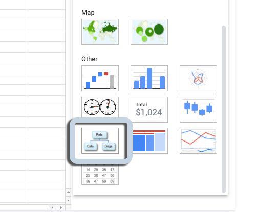
On the right hand side, in the Chart Editor menu, click on the “Chart Type” picklist, scroll down, and select the “Organizational Chart”.
Now, you may need to resize your chart to fit all of the data, but you’ll have a completely organized and labelled organizational chart to copy and paste wherever you need it!
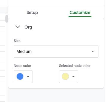
If you’d like to make any tweaks to size, colors, etc… you can click the three-dot icon in the upper right of your chart and select “Edit chart”.
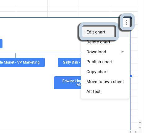
And that will bring back the edit panel where, on the “Customize” tab you can tweak to your heart’s content.
And now you’re all set! 1 org chart, in a flash!
I’ll also add one more helpful hint if you’re planning on making this chart more final draft than first: if you want to add some additional formatting to the labels, say, having the name appear above the title, you’ll have to do that in the cells you’re using to generate the chart.
In Google Sheets, adding an in-cell line break is as easy as “Alt+Enter”. So here you’ll see I’ve updated our CEO’s cell to be a little more broken out by using “Alt+Enter” to insert a break after their name and after the hyphen to make our text a bit more readable. And it updates the chart in real-time (visible in the lower right).
NOTE: If you make changes to a name/title cell you’ll have to make sure those changes are reflected in the corresponding places in the righthand column for the chart to still align everyone correctly.
And now you’re all set!
And until next time, keep working hard, smart, and happy. We’ll see you in the cloud.