Post
Even Better Reports and Dashboards — Part 1
Posted on March 20, 2019 (Last modified on January 16, 2026) • 7 min read • 1,299 wordsReports and Dashboards are two of the most celebrated features of Salesforce, and rightly so.

They contextualize the chaotic. They organize, illuminate, and illustrate insights into our operations on a daily, quarterly, yearly scale. Refining the ever-increasing supply of data into digestible, actionable intelligence is a necessity for 21st century orgs, and so improvements to Salesforce’s reporting capabilities are a boon to businesses everywhere.
Happily for us (and admins all over the world) the Spring ’19 Release that dropped last month was packed with feature and functionality upgrades that make reports and dashboards even more effective, intelligent, and enlightening. In this two-part post we’ll run through our favorite data-delivery improvements included in the release and how they’re empowering admins to be even more productive.
Today we’ll talk about the upgrades to reporting, and next week we’ll walk through the exciting updates to dashboards.
Let’s get to it!

Reporting
Joined Reports in Lightning
A longtime favorite from Salesforce Classic and fresh out of its Lightning beta, Joined Reports have officially become a universally supported part of the reporting family!
The ability to wed reports with different, but complementary, data enables even more insight into operations, activities and relationships. Giving you the ability to analyze data across multiple report types, Joined Reports empower admins to recognize complex (and simple) connections between different data sets, for example, pairing “Opportunities with Products” and “Cases with Assets”. Joined Reports can also be used to provide multiple, simultaneous views of an object, like viewing Closed Won and Closed Lost opportunities side-by-side to help you spot the differences.
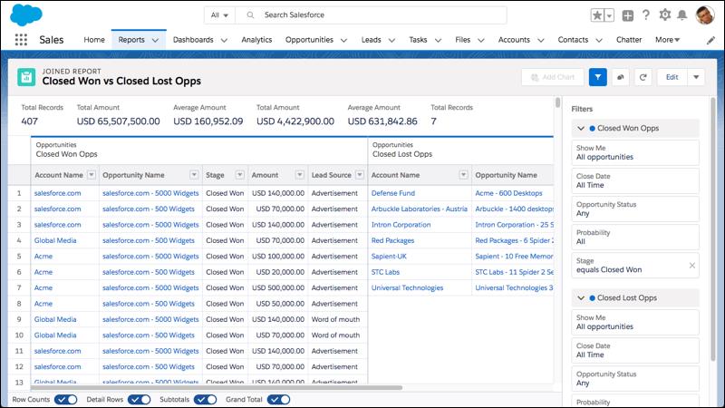
A few of Salesforce’s favorite use-cases are a three-block sales report providing a complete view of “accounts”, “opportunities”, and “cases” so you can see the whole customer flow, and a three-block customer service report made up of cases filtered by “open”, “in progress”, and “closed” to provide a high-level overview of the entire CS pipeline.
You can check out even more examples of effective joined reports right here, and the best part is you’ll no longer be limited to operating in Classic!
Improved Report Run Page
Next up, and also freshly promoted from its successful beta rollout is the improved Report Run Page functionality! Formerly known as the “Enhanced Run Page, the default report viewing behavior has been made easier to read in two significant ways.
First, column headers are now “sticky” so no matter how long your report is, you’ll never have to scroll all the way back up to the top to remember which column is which. Now the labels will follow you down while you scroll, meaning your labels are always clear and your data is always digestible at a glance!

That’s pretty neat!
And the second report run page improvement is the addition of summary headers at the top of your reports to help you quickly gauge your most important metrics at a glance! Now, summarized metrics in your report (like grand totals, sub-totals, record counts, formula column results, etc…) appear at the top of the page in an easy-to-read, larger font.
The (up to 8!) summarized metrics appear automatically from left to right in the same order they appear in the report and that means no more scrolling and scanning through the whole thing to find the summaries you care about most. This feature’s especially valuable for shared reports where your audience will have varying degrees of interest, time, and willingness to dig through the data and it can also help you identify the important, impactful metrics that ought to make it onto a dashboard.
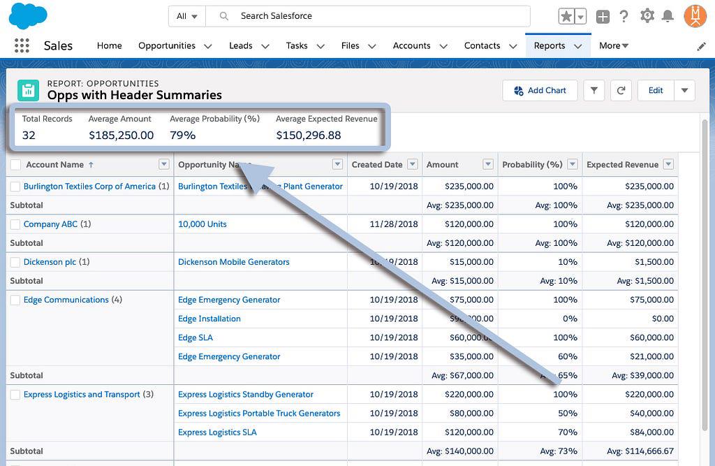
And with both features now standard on the report run page, even your most over-sized, data-packed, and field-full constructions can be quickly understood by users at every level of your org!
Resizable Columns
Excel aficionados rejoice! No longer are column-widths tied to the size of your monitor (or the person’s who built the report). In both the report builder and the run page you’re now able to freely adjust column-width on the fly, until everything looks just the way you’d like it.
Simply hover your mouse over the column-header’s right edge until the double-arrow-cursor appears and then drag away to resize the column to your heart’s content!
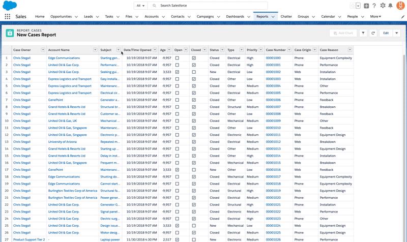
No more unused white space or obscuring ellipses, unless you want them.
Conditional Formatting
This is another one for Excel fans (and those of us who were used to this in Classic), conditional formatting! When you want your users to be able to gauge their goal progress at-a-glance or want the C-Suite to be able to get a speedy grasp of where the operation is on-target versus at-risk, conditional formatting provides an easy, visual way to contextualize report results.
Spring ’19 introduced conditional formatting in Lightning as a beta, so it’s live now and can be applied to any of your summary or matrix reports. And Salesforce added a few improvements over its Classic application as well. Now you can apply up to five formatting rules to a report, define up to three bins for each rule you apply, and, best of all, you can customize the colors!
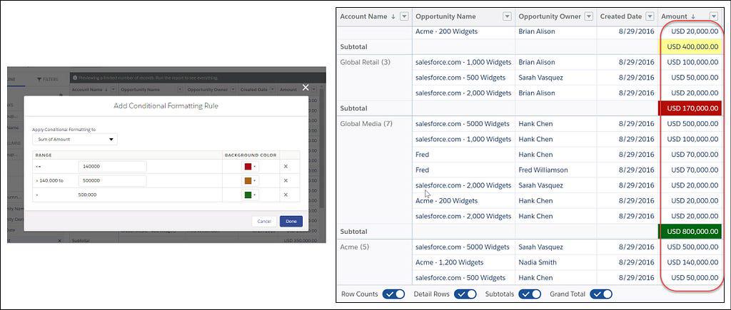
You can finally get those colorful summaries back into your weekly team meetings without having to bounce back and forth between Lightning and Classic!
Stacked Summaries
Matrix reports are awesome and offer a unique way to summarize and compare huge quantities of data. But that also means they can be large, complex, and difficult to digest on one screen without a ton of scrolling. Until Stacked Summaries, that is! In the footer of your matrix reports, you’ll now see a toggle for “Stacked Summaries” that, when flipped, consolidates your matrices into neatly organized summaries on their appropriate rows.
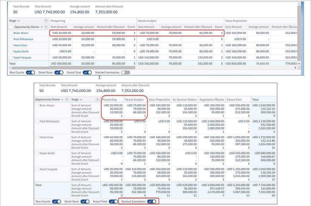
Admins and users no longer have to scroll left and right, back and forth trying to compare each field, and the reduced real estate requirements mean you’re no longer stuck busying both of your monitors with one extra-wide report. Just open your favorite matrix report, flip the toggle in the footer, and enjoy!
Recap
Another update designed to eliminate the need to bounce back and forth between Classic and Lightning Experience is the addition of Historical Tracking Reports in LE. While matrix reports have had this functionality for a while, now tabular historical tracking reports are also getting support, cutting down on the clicks it takes to see what’s changed!
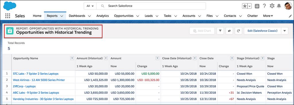
Valuable both for forecasting and strategic planning, historical tracking reports help you understand the relationships between data and execution over time. Identifying common under- or over-estimates, calibrating your projections, and discovering the day-to-day details that make your data change are easier when you can get a quick look at the differences from run-to-run. And now you can, right in the Lightning Experience.
Report (and Dashboard) Subscriptions by Group or Role
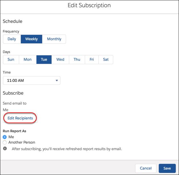
And last, but not least, one more time-saving treat for admins. Now you can manage report and dashboard subscriptions by group or role. That means your subscriber lists are always up to date, even when users change roles or group membership changes! No more vague email requests saying, “the new guy doesn’t get all the same reports as Dana and I. Can you fix that?”. No more detective work to figure out which users should be subscribed to which reports. Just set your group and role subscriptions and let Salesforce handle the organization and sending!
Those are the report improvements that have our office buzzing. And if you’d like some help making the most of your org’s data, give us a call! We can help you implement new functionality, configure and customize your org, and make sure you’re capturing the most ROI from your Salesforce investment.
Stay tuned next week when we’ll run through part two of this series and look at the biggest improvements to dashboards. Until then, keep working hard, smart, and happy! And we’ll see you in the cloud.