Post
Summer ’24 Release Highlights: Record Pages Get a Glow Up
Posted on May 3, 2024 (Last modified on January 16, 2026) • 4 min read • 640 wordsAs we continue our countdown to the Salesforce Summer ’24 Release, we’re back with another round of Release Highlights!

As we continue our countdown to the Salesforce Summer ’24 Release, we’re back with another round of Release Highlights! The series where we pore through the pages and pages of release notes and present our picks for the most exciting, innovative, and org-influential updates, upgrades, and features headed our way (and yours) when the release goes live in late-May/early-June. Today we’re taking a look at a couple improvements that are sure to appeal to the more aesthetically inclined. Changes that will decrease visual clutter, improve readability, at-a-glance clarity, and, most importantly, accessibility! Let’s dive in!
Blank Spaces (for field alignment)
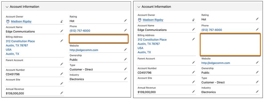
Since Taylor Swift’s moved on to TTPD, Salesforce can now try their hand as ‘Blank Space’ providers without fear of copyright strikes from the music industry’s mainstay. But unlike Taylor’s Blank Space, Salesforce’s isn’t for writing names, but instead for spacing out fields for better alignment and visual clarity on record pages — specifically pages with Dynamic Forms enabled. Admins will now be able to customize field alignment in Dynamic Form field sections with the new Blank Space component. It’ll provide the option to both: Separate fields vertically inside a field section, by providing a blank space with a row height of 1 (left image) or…

…an option to select to Align fields horizontally so the blank space will expand to match its next-door counterpart and keep everything aligned horizontally on the page as it was when setting up the page layout (right image). I can already hear the sigh of relief from graphically-minded admins everywhere. And, before you ask it is worth noting that the blank space component will be considered a field and will count against the limit of 100 fields per region, though it won’t count against the component page limit.
Rich Text Headings in Lightning App Builder
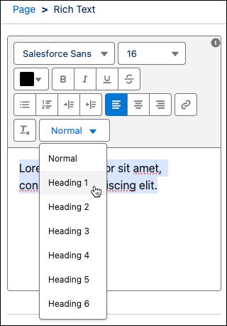
Next up is a feature that’s not only going to improve look and feel, but also accessibility — which makes it a huge win for admins and users everywhere! Summer ’24 is giving us the ability to customize rich text on Lightning pages by giving it style values such as “Heading 1” and “Heading 2” using the new dropdown menu in the Rich Text component editor.

And, most excitingly, assigning rich text a Heading value also makes that text accessible for users viewing your Lightning page with a screen reader! Given that, I’d say it’s fairly safe to assume that a vast majority of the Lightning Pages we see built post-Summer-24 will employ rich text Headings, and that retrofitting existing apps will be high priority as well. In fact this, almost inconspicuous improvement, might change the look and feel of orgs everywhere in a way that we haven’t really seen since the roll out of Lightning! To make the change admins will simply need to navigate to a Lightning page in the Lightning App Builder, and select a Rich Text component on the canvas. Select a block of text inside the editor, and use the new styling dropdown to give the text a heading value!
Conclusion
These two, seemingly simple, changes are set to make Salesforce more useable, readily-digestible, and visually-engaging than ever before and embody the most significant step away from “spreadsheet-ification” we’ve seen in a while! Admins will definitely want to familiarize themselves with the LP header process so they’re ready to hit the ground running, gameplan which Lightning Page headers to update first, and survey users about page layouts that might need a little visual help from some special spacing implementation and alignment. And of course, they’ll also want to be sure to stay tuned right here for more news, updates, and insights on Salesforce and the Summer ’24 Release as we get closer and closer to go-live. Until then, keep working hard, smart, and happy! And we’ll see you in the cloud.