Post
Summer ‘25 Screen Flow Updates!
Posted on July 18, 2025 (Last modified on January 16, 2026) • 2 min read • 321 wordsTop 4 UX Improvements for Screen Flows
The summer sun is out in force and the Summer ‘25 release is already live in orgs everywhere—and we’re still discovering more exciting updates, upgrades, and improvements in the release notes!
Today, we’re looking at some big improvements to user experience (UX) in Screen Flows, and the best part is that admins can roll them out right now!
Let’s dive in!
Add Icons!
Maybe you’re trying to reduce the cognitive load on your users, or maybe you just want to modernize the look and feel of your Screen Flows—but Summer ‘25 brought two big improvements in that area:
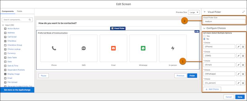
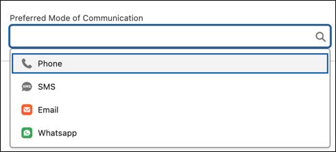
Thanks to Summer ‘25, admins can now add icons to each of their users’ potential choices in Choice Resources and then use those icons in Choice Lookup…
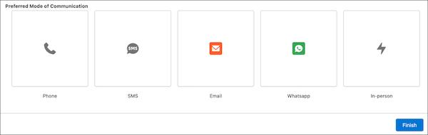
… and Visual Picker components!
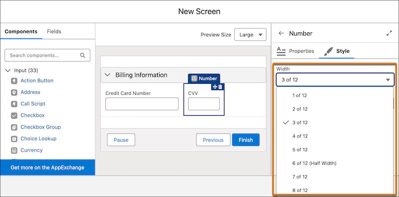
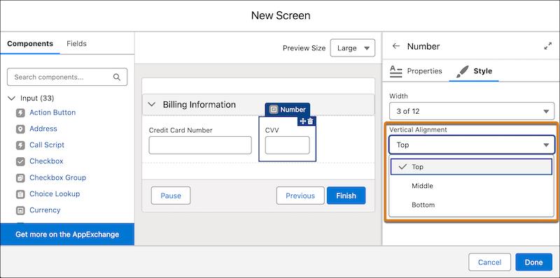
Formatting Flexibility
Admins are also getting more control over the look and feel of their screens with the addition of the ability to customize the width of screen components and record fields and adjust the vertical alignment of components to make everything look just right for their users!
It’s as easy as adjusting individual components’ width…
… or vertical alignment!
Improved Previews!
Last but not least, make sure all those visual improvements look their best—on whatever screens your users are using—with the addition of real-time screen previews for various sizes of screens!
The Preview Size feature lets you see how your screen will appear on large, medium, or small devices while you’re setting up your Flow.
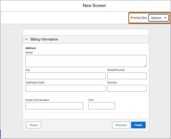
No more small-screen surprises!
Get Building!
All that’s left for admins to do is start implementing! Improved Screen Flow UX is only a setup screen away, now that Summer ‘25 is in full swing. We can’t wait to see these features in use in the wild.
Until next time, keep working hard, smart, and happy. And we’ll see you in the cloud.